
MOUNT ANTERO
Enhancing jewelry shopping through personalized, elegant, and allergy-friendly digital experiences.
JEWELRY GALLERY
Mount Antero Gallery - UI/UX Case Study
Overview
This project aimed to enhance the digital experience for Mount Antero Gallery, a boutique jewelry store. As the lead UI/UX designer, I focused on designing a high-fidelity prototype for a seamless, personalized, and accessible shopping experience.
Role:
UX Designer
Researcher
Graphic Designer
Tools
Problem Statement
Customers were hesitant to buy jewelry online due to lack of trust, difficulty in visualizing pieces, and concerns about allergies. The goal was to address these pain points by creating an immersive digital experience.
Goals & Objectives
- Enhance product personalization
- Integrate virtual try-on
- Improve product discoverability
- Ensure allergy-friendly filtering
User Research
Surveys and interviews revealed that users often felt overwhelmed when shopping for jewelry online. We analyzed key themes using affinity diagrams to prioritize features like hypoallergenic filters, style guides, and virtual previews.
Competitive Analysis
We compared 5 top online jewelry stores. Most lacked customizable options or clear information about metal allergies. Mount Anteros niche offering of personalized and sensitive-skin safe products became the core differentiator.
User Persona & Journey
Rose Golden, a 34-year-old professional, is sensitive to most metals. She wants elegant, safe jewelry without spending hours browsing. Her journey begins with a search for 'hypoallergenic rings' and ends with a confident purchase.
Information Architecture
Card sorting revealed that users grouped products by material and occasion. The final site map reflects this logic.
Wireframes & Prototyping
Low and high fidelity wireframes were developed iteratively. Feedback loops were essential in refining layout and navigation.
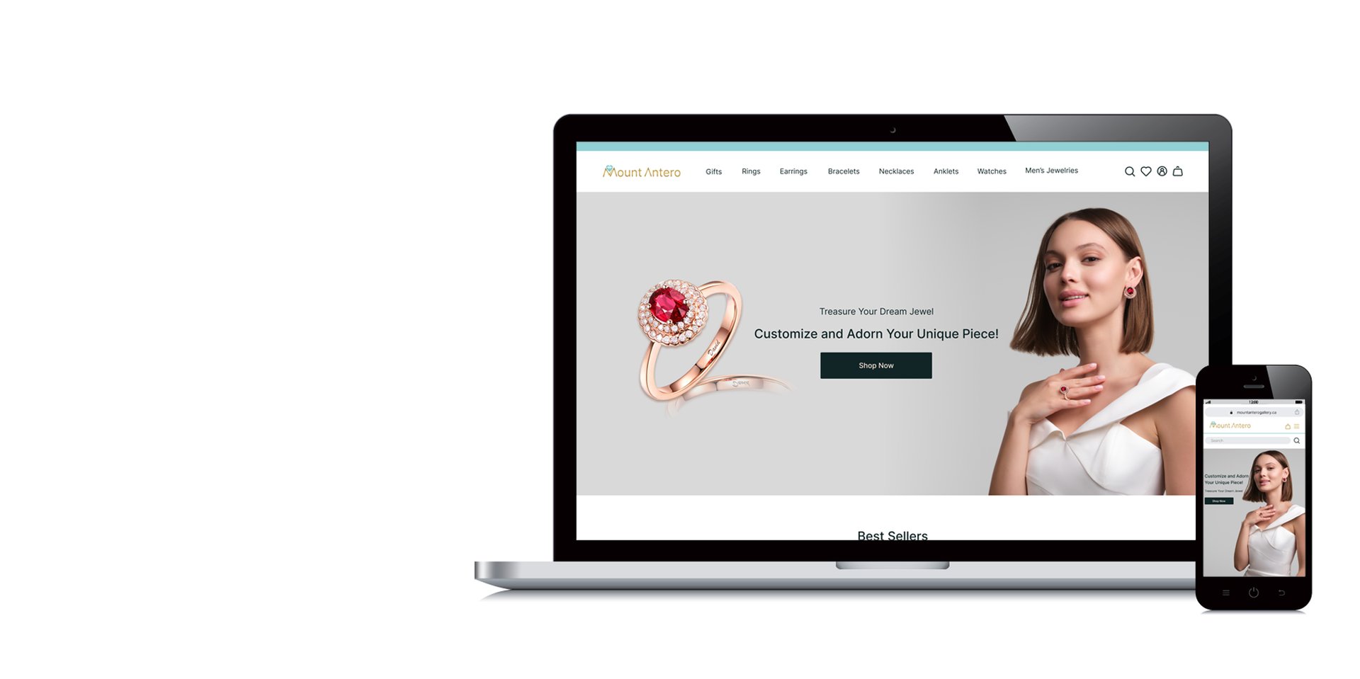
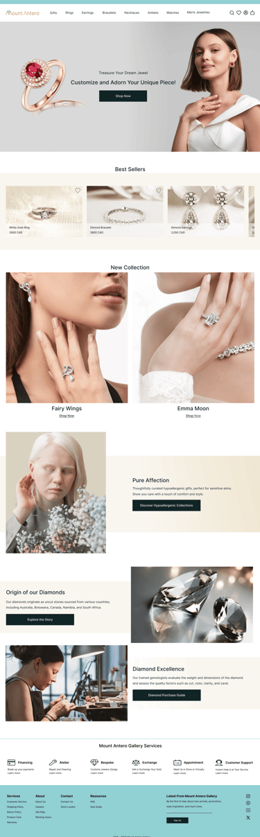
Final UI Design Highlights
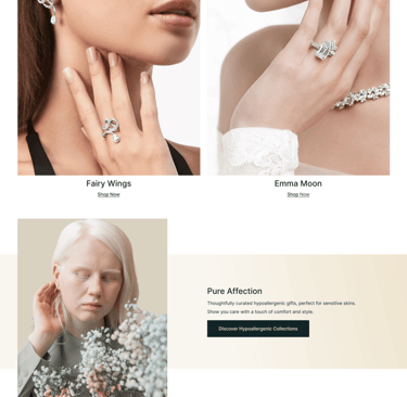
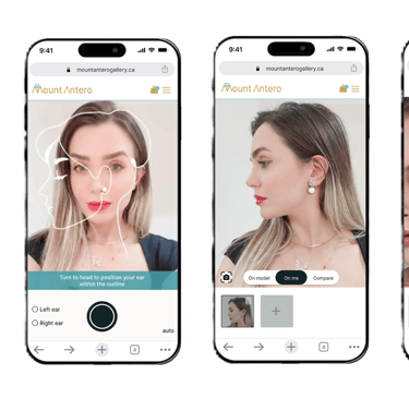
The UI features a dark theme with clean lines, high contrast text, and accessible CTAs. The 'Try On' button and 'Allergy Filter' are key interactive features.
Key Features
- Virtual Try-On: Try rings using phone camera
- Allergy Filter: Show only nickel-free options
- Customization: Select stone, metal, engraving
- Smooth Checkout: Minimal clicks, secure process
Conclusion
The project delivered a user-centric, elegant jewelry shopping experience. Future updates may include AI recommendations and user reviews integration.


CARDAN
AUTOMOTIVE SERVICE
Enhancing service providers’ workflow with intuitive booking management, real-time job tracking, and streamlined client communication
Overview
Cardan is an intelligent automotive service platform based in Isfahan, Iran. While its primary aim is to connect car owners with trusted technicians, an essential component of the redesign was focused on improving the Service Provider interface, enabling garages and technicians to efficiently manage service requests, update their availability, and build trust with clients.
Our goal in this redesign was to empower service providers with better tools, intuitive workflows, and visibility — ultimately increasing engagement and satisfaction across both sides of the platform.
My Role
UX/UI Design for Service Provider Dashboard & Mobile App
User Research with Local Technicians
Design System & Visual Identity Extension
Prototyping and Iterative Testing
Duration: 3 months
Team Size: 4 (Designers + Researchers)
Tools Used: Figma, FigJam, Zoom, Persian-language user testing tools
Goals for the Service Provider App
Provide an intuitive dashboard for daily bookings and service management
Improve visibility of customer requests and simplify scheduling
Ensure providers can edit their profiles, set availability, and manage multiple services
Enable fast vehicle check-in via QR code scanner
Support communication with clients in-app
User Interviews & Heuristic Review:
We engaged with 7 local service providers (mechanics, auto electricians, and shop owners) to evaluate the previous system. Here’s what we found:
Pain Point 1: Providers lacked a clear calendar view or appointment system, resulting in missed or double-booked clients.
Pain Point 2: Communication with car owners was fragmented (calls, WhatsApp, paper records).
Pain Point 3: No visibility into customer reviews or service history.
Information Architecture & Flows
Using card sorting and persona development (based on real Iranian technicians), we structured the provider dashboard with clarity and minimal cognitive load.
Key flows include:
Accepting a booking from a nearby car owner
Managing service queue for the day
Editing availability and services offered
Vehicle check-in via scan for faster intake
Viewing customer feedback and history
Design Iterations
Navbar Adjustments for Providers
The "Dashboard" tab was made default — offering a quick overview of bookings and pending requests.
A dedicated "My Services" section was added to allow fast editing of services and pricing.
A "Scan" button (for QR vehicle check-ins) was prominently placed in the header.
Notifications (e.g. new booking requests, cancellations) were centralized in one tab for clarity.
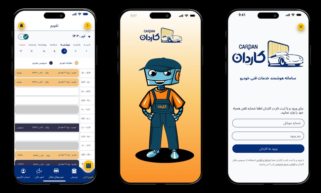
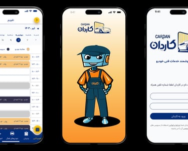
Dashboard Design – Key Screens
1. Daily Schedule & Overview
A visual timeline displays today’s bookings and their statuses (confirmed, pending, completed). Color coding was used for service type.
2. Service History and Earnings
Providers can review completed services, customer ratings, and monthly earnings breakdown.
3. Customer Details and Vehicle Info
Each booking includes details like car model, requested service, service history, and direct messaging.
Usability Testing with 3 Technicians
2 out of 3 providers praised the QR-based vehicle check-in as “game-changing”.
All testers appreciated the cleaner daily queue layout, saying it reduced stress in peak hours.
The in-app profile editing was found easy, though some users requested a more detailed FAQ for service tagging.
Key Features Delivered
Interactive Daily Dashboard
Instant Booking Notifications
QR Code Scanner for vehicle registration
Editable Service Profile & Pricing
Integrated Chat with Customers
Performance Metrics (monthly earnings, top services, rating trends)
What I Learned
Designing for service providers in a bilingual, right-to-left context challenged us to rethink layout assumptions and prioritize familiarity. Observing the mental models of these users (analog systems, WhatsApp, paper schedules) allowed us to design tools that felt native — not disruptive.
Next Steps
Expand provider onboarding with micro-tutorials
Introduce analytics dashboard for service trends and marketing insights
Add multi-location management for businesses with several branches
Cardan Automotive Service - UI/UX Study Case
JOOAY
INCLUSIVE ACTIVITY FINDER

Jooay is a app designed to help children and youth with disabilities discover accessible and inclusive activities in their communities.